
To design accessible charts for inclusive communication, focus on ensuring high color contrast between data elements and backgrounds, avoiding reliance solely on color. Incorporate patterns or textures to differentiate elements and support users with color vision deficiencies. Make sure all interactive features are keyboard accessible with clear focus indicators. Regular testing, especially traversing with a keyboard, helps identify issues early. Continuing will reveal practical tips to make your visuals truly inclusive.
Key Takeaways
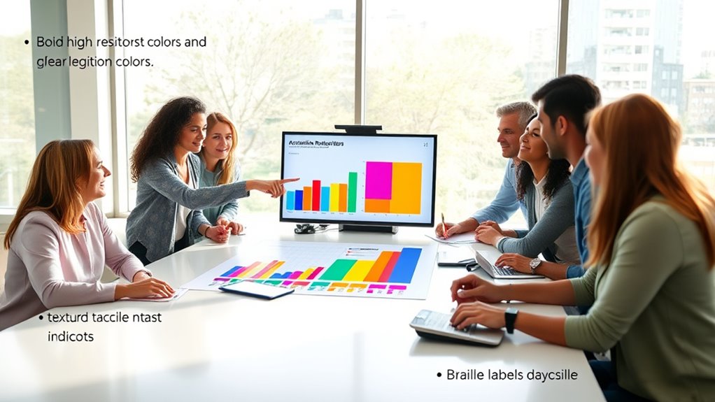
- Use high contrast color combinations and avoid relying solely on color to differentiate data.
- Incorporate patterns, textures, or labels to provide additional cues beyond color.
- Ensure all chart elements are navigable and focusable via keyboard for inclusive interaction.
- Test visualizations with keyboard navigation and color contrast checks to identify accessibility issues.
- Prioritize accessibility from the start to create clear, understandable, and inclusive data visualizations.

Ever wondered how to make your data visualizations accessible to everyone? Ensuring your charts are inclusive means considering how people with diverse abilities interact with your visuals. One of the most critical aspects is optimizing color contrast. When designing your charts, you need to choose color combinations that provide sufficient contrast between background and foreground elements. This helps users with visual impairments, such as color blindness or low vision, distinguish data points clearly. Instead of relying solely on color to convey information, incorporate patterns or textures in your chart elements. For example, using dashed or dotted lines alongside color differentiation can make your data easier to interpret for everyone. By focusing on color contrast, you prevent your visualization from becoming a barrier for users who struggle to differentiate hues.
Another key element is ensuring your charts are navigable via keyboard. Many users with mobility impairments or those who prefer keyboard navigation rely on tab keys and other shortcuts to explore digital content. You should make sure that all interactive parts of your chart—such as tooltips, data points, or filters—are accessible through keyboard commands. This involves designing your visualization so that users can tab through different elements logically and intuitively. For instance, providing clear focus indicators allows users to see which part of the chart they’re currently interacting with. Additionally, enable keyboard commands to activate or explore data points, ensuring no user is left out because of a lack of mouse access. Incorporating accessible data representations helps ensure your visualizations are usable by a broader audience.
Designing with keyboard navigation in mind also means avoiding traps like elements that aren’t focusable or that trap the focus cycle. Test your visualizations by navigating through them with just your keyboard to identify and fix any issues. Combining this with thoughtful color contrast choices creates a more inclusive experience. Remember, accessibility isn’t an afterthought; it’s a core component of effective communication. When you make it easy for people to navigate and interpret your charts—regardless of their physical abilities or visual capabilities—you foster a more inclusive environment. Your goal should be to provide clear, usable, and understandable data visualizations that everyone can access and benefit from. By paying attention to color contrast and keyboard navigation, you’re taking essential steps toward creating truly accessible charts that serve all audiences equally.
accessible data visualization tools
As an affiliate, we earn on qualifying purchases.
As an affiliate, we earn on qualifying purchases.
Frequently Asked Questions
How Can Color-Blind Users Differentiate Chart Data Effectively?
You can help color-blind users differentiate chart data by using high color contrast and clear symbol differentiation. Choose distinct patterns or textures alongside colors to make sure each data series stands out. Avoid relying solely on color differences; instead, combine contrasting shades with varied symbols or line styles. This approach makes your charts more inclusive, ensuring that everyone can interpret the data accurately regardless of their ability to perceive color distinctions.
What Tools Assist in Creating Accessible Chart Descriptions?
Tools like screen reader compatibility features and alternative text options help you craft clear, comprehensible chart descriptions. You enable accessibility by choosing software that supports screen readers, ensuring your descriptions are easily navigable. You should also add descriptive alt text that succinctly summarizes chart data. These tools transform visual data into a textual tapestry, allowing users with visual impairments to perceive and participate in your content effortlessly and effectively.
How Do I Test Charts for Accessibility Compliance?
To test your charts for accessibility compliance, you should follow testing best practices like using screen readers to verify they can interpret your charts correctly. Check contrast ratios, font sizes, and label clarity to improve chart accessibility. Also, validate that your descriptions and alternative text meet standards. Regularly review your charts with accessibility evaluation tools and gather feedback from diverse users to identify and fix potential issues effectively.
Can Accessible Charts Be Visually Appealing and Innovative?
Yes, accessible charts can be both visually appealing and innovative. You can achieve visual harmony by balancing colors, shapes, and layout, ensuring clarity without sacrificing style. Incorporating aesthetic innovation, like dynamic interactions or unique data visualizations, makes your charts engaging while maintaining accessibility standards. This way, you create inclusive designs that captivate your audience and uphold principles of inclusive communication, blending creativity with functionality seamlessly.
What Are Common Mistakes to Avoid in Accessible Chart Design?
You want your charts to shine, but avoid common pitfalls like color misuse and overly complex designs. Steer clear of confusing color choices that hinder understanding and keep your visuals simple enough for everyone to grasp easily. Overly intricate charts can overwhelm viewers, so focus on clarity and thoughtful use of color. By doing so, you guarantee your message reaches all audiences effectively, making your charts both attractive and accessible.
keyboard accessible chart software
As an affiliate, we earn on qualifying purchases.
As an affiliate, we earn on qualifying purchases.
Conclusion
Think of your chart as a bridge connecting diverse minds. When you design it accessibly, you build a sturdy, welcoming span that everyone can cross with ease. By considering color contrast, clear labels, and alternative text, you guarantee no traveler is left stranded. Remember, an inclusive chart is like a well-crafted map—guiding all users smoothly to understanding, fostering a landscape where communication flows freely and everyone reaches the destination together.
high contrast color palette for charts
As an affiliate, we earn on qualifying purchases.
As an affiliate, we earn on qualifying purchases.
patterns and textures for data charts
As an affiliate, we earn on qualifying purchases.
As an affiliate, we earn on qualifying purchases.