

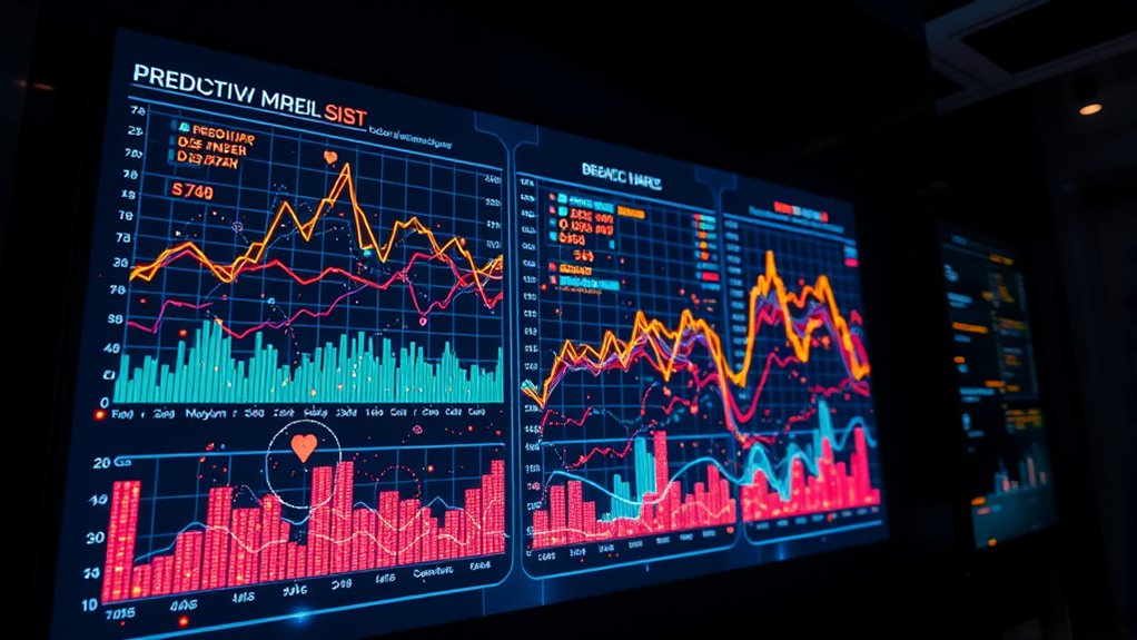
Predictive analytics visualization helps you see future trends by transforming complex data into clear visuals like graphs and heat maps. These tools let you analyze past patterns, spot shifts, and forecast market demands, enabling proactive decisions. Real-time dashboards provide instant insights into key metrics, so you can respond quickly to changes. By making data accessible and understandable, visual analytics support smarter strategies—discover more ways to harness this powerful approach as you continue exploring.
Key Takeaways
- Visualizations like line graphs and heat maps reveal patterns in historical data to forecast future trends.
- Real-time dashboards provide instant insights, enabling proactive adjustments and more accurate predictions.
- Visual tools make complex predictive analytics accessible to non-technical decision-makers, fostering strategic alignment.
- Trend forecasting enhances decision-making in sales, risk management, and supply chain optimization.
- Clear visual representations help anticipate market shifts and operational changes, supporting future-focused strategies.
Have you ever wondered how businesses forecast future trends and make data-driven decisions? It all begins with understanding the power of predictive analytics visualization. By transforming complex data sets into clear, visual formats, companies can anticipate what’s ahead and act proactively. One of the most valuable tools in this process is real-time dashboards. These dashboards compile live data streams, providing instant insights into current operations. With real-time dashboards, you don’t have to wait for end-of-month reports; instead, you get immediate visibility into key metrics. This allows for quick adjustments, better resource allocation, and more accurate trend forecasting. Additionally, leveraging research-backed insights can improve the accuracy of predictions and decision-making processes.
Real-time dashboards enable immediate insights, empowering quick decisions and accurate trend forecasting.
Trend forecasting is the backbone of predictive analytics visualization. It involves analyzing historical data to identify patterns and project future behavior. When you visualize trends effectively, you can spot shifts in customer preferences, market demands, or operational efficiencies long before they become obvious. These visualizations often take the form of line graphs, heat maps, or scatter plots, making complex data more accessible. The clearer the visualization, the better you can interpret the underlying patterns and make informed decisions. For example, a business might notice a rising trend in online sales during certain months, allowing them to ramp up marketing efforts or inventory levels accordingly.
Using visual tools in predictive analytics also helps bridge the gap between data scientists and decision-makers. With intuitive dashboards and visualizations, stakeholders who may not be tech-savvy can understand the story the data tells. This democratization of data ensures everyone is aligned on strategy and aware of potential opportunities or risks. Furthermore, these visual tools are essential for scenario analysis. You can simulate different future scenarios based on current data, helping you choose the best course of action.
The real strength of predictive analytics visualization lies in its ability to synthesize vast amounts of data into actionable insights. Instead of drowning in raw numbers, you see the bigger picture, enabling you to make well-informed, strategic choices. Whether it’s forecasting sales, optimizing supply chains, or managing risks, visual analytics give you a glimpse into the future. As data continues to grow exponentially, leveraging real-time dashboards and trend forecasting tools becomes not just advantageous but essential. They empower you to stay ahead of the curve, respond swiftly to changes, and ultimately make smarter, data-driven decisions that shape the future of your business.

Getting Started with Grafana: Real-Time Dashboards for IT and Business Operations
As an affiliate, we earn on qualifying purchases.
As an affiliate, we earn on qualifying purchases.
Frequently Asked Questions
How Does Predictive Analytics Visualization Improve Decision-Making?
Predictive analytics visualization improves your decision-making by highlighting trend accuracy, making complex data easier to interpret. When visuals are engaging, user engagement rises, helping you quickly grasp key insights. This clarity allows you to identify patterns, forecast outcomes, and make informed choices confidently. Visual tools turn raw data into actionable information, reducing uncertainty and empowering you to act proactively based on reliable, trend-driven insights.
What Are Common Pitfalls in Visualizing Predictive Analytics Data?
Visualizing predictive analytics data is like steering through a stormy sea—you need clarity to avoid dangers. Common pitfalls include data misinterpretation, where visuals mislead, and overfitting errors, making models too tailored and unreliable. These issues can cause you to draw false conclusions or make poor decisions. To avoid these pitfalls, guarantee your visuals are clear, accurate, and avoid overcomplicating the data, helping you make better-informed choices.
Which Tools Are Best for Predictive Analytics Visualization?
You should consider tools like Tableau, Power BI, and QlikView for predictive analytics visualization. These platforms excel at data storytelling and offer advanced visualization techniques that make complex insights clear. They enable you to create interactive dashboards, highlight key trends, and communicate predictions effectively. By choosing the right tool, you can transform raw data into compelling visual stories, helping you make informed decisions based on future forecasts.
How Can Small Businesses Implement Predictive Analytics Visualization?
You can implement predictive analytics visualization by starting with user-friendly tools like Tableau or Power BI, which help you analyze customer segmentation and trend forecasting easily. Focus on collecting relevant data, then create visual dashboards that highlight patterns and predictions. Regularly update your visualizations to adapt to new data, enabling you to make smarter decisions, optimize marketing, and improve customer engagement with clear, actionable insights.
What Ethical Considerations Exist in Predictive Data Visualization?
You need to prioritize data privacy by securely handling sensitive information and obtaining proper consent. Be aware of bias mitigation, ensuring your visualizations don’t perpetuate stereotypes or unfair treatment. Always consider how your predictive insights might impact different groups and maintain transparency about your methods. Ethical visualization fosters trust and fairness, helping you avoid potential legal issues and reputational damage, while promoting responsible data use.

Business Analytics Essentials You Always Wanted to Know: Learn Data Analytics, Predictive Techniques, Visualization, and Tools for Effective Decision-Making (Self-Learning Management Series)
As an affiliate, we earn on qualifying purchases.
As an affiliate, we earn on qualifying purchases.
Conclusion
Now, as you gaze at the predictive analytics visualization, you hold a glimpse of the future in your hands—like a crystal ball revealing hidden patterns. While data points shimmer like stars in the night sky, their insights shape your next move, blending mystery with clarity. With every chart and graph, you’re not just seeing the future; you’re actively shaping it. Embrace this power, and let the data lead you into a brighter tomorrow.
BUSINESS DATA ANALYTICS WITH R: ANALYZE SALES, CUSTOMER BEHAVIOR, AND BUSINESS TRENDS TO MAKE DATA-DRIVEN DECISIONS (REAL-WORLD DATA SCIENCE WITH R)
As an affiliate, we earn on qualifying purchases.
As an affiliate, we earn on qualifying purchases.
heat map data visualization tool
As an affiliate, we earn on qualifying purchases.
As an affiliate, we earn on qualifying purchases.